[ECO Bounty] DePINscan Promotional Banner Image Displaying Too Small on Mobile
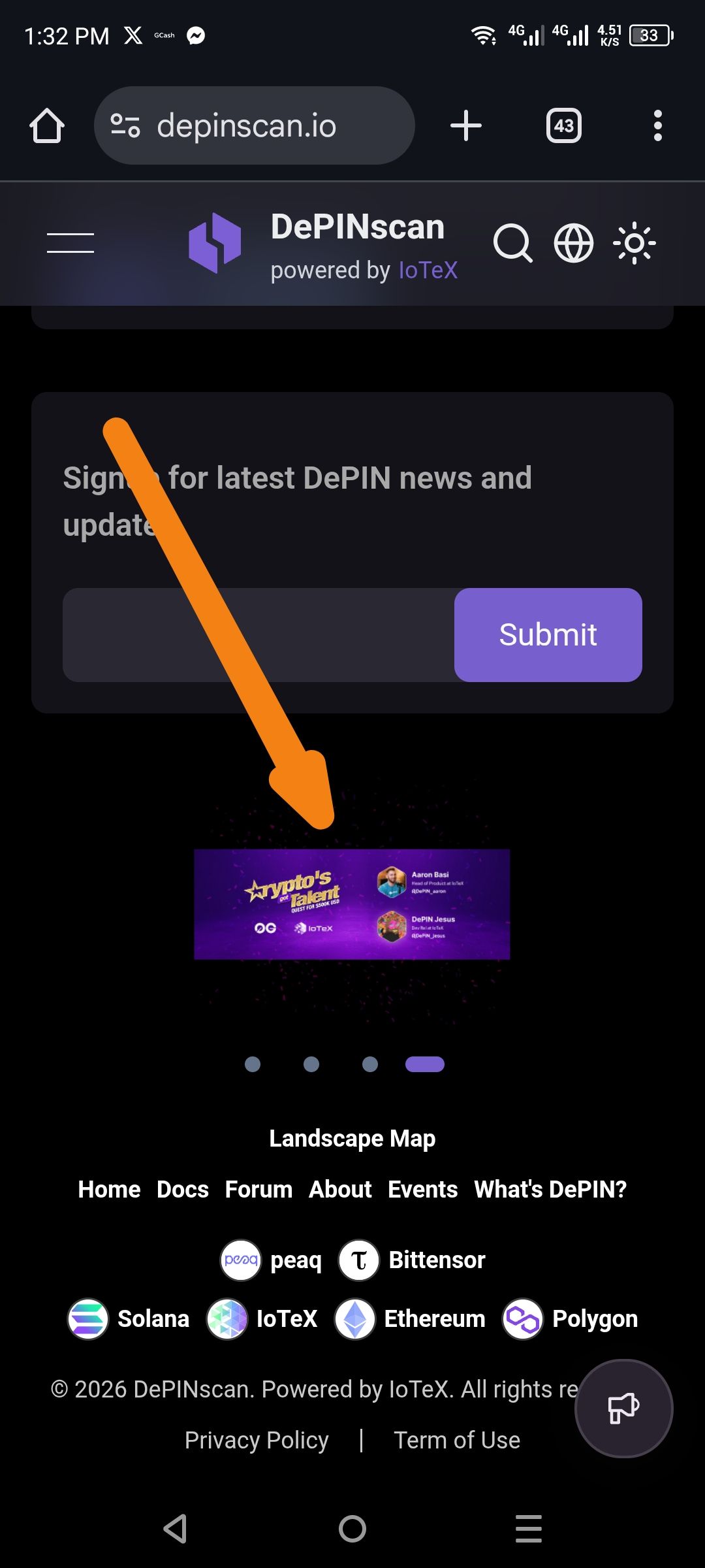
Description: The promotional banner/carousel element on the mobile homepage is rendering at an unusually small scale, making the text and imagery difficult to read. The banner appears to be a "Crypto's Talent" promotional card with sponsor logos and profile avatars, but it is constrained to a very narrow height/width compared to the screen width.
Steps to Reproduce:
Open a mobile browser on an Android or iOS device.
Navigate to https://depinscan.io/.
Scroll to the section immediately below the "Sign up for latest DePIN news" email subscription form.
Observe the carousel/banner area indicated by pagination dots (● ● ● ●).
Expected Result: The banner image should span the full width of the mobile viewport (or maintain a reasonable max-width with readable text) and have sufficient height to display the promotional content clearly.
Actual Result: The banner is displayed at approximately 30-40% of the available screen width, compressing all text and making the "Crypto's Talent" copy and participant avatars illegible without zooming in.
Suggested Fix: Check the CSS for the carousel/slider component (likely a swiper or similar library). The image container may have a max-width set too low, missing width: 100%, or the image itself may not have the object-fit: cover or responsive scaling properties configured for mobile breakpoints.
Wallet Address: io1tkw393kejmxwnd454twc6020sxcyvh5dxqmren
Device & Environment:
-Operating system: Android 13
-Device model: Redmi Note 10 Pro
Please authenticate to join the conversation.
In Review
New Issue
5 months ago

cryptotestnet
Subscribe to post
Get notified by email when there are changes.
In Review
New Issue
5 months ago
cryptotestnet
Subscribe to post
Get notified by email when there are changes.