[Eco Bounty] Depinscan UI Layout Misalignment on Mobile Devices
Platform: Mobile Web (Android/Chrome)
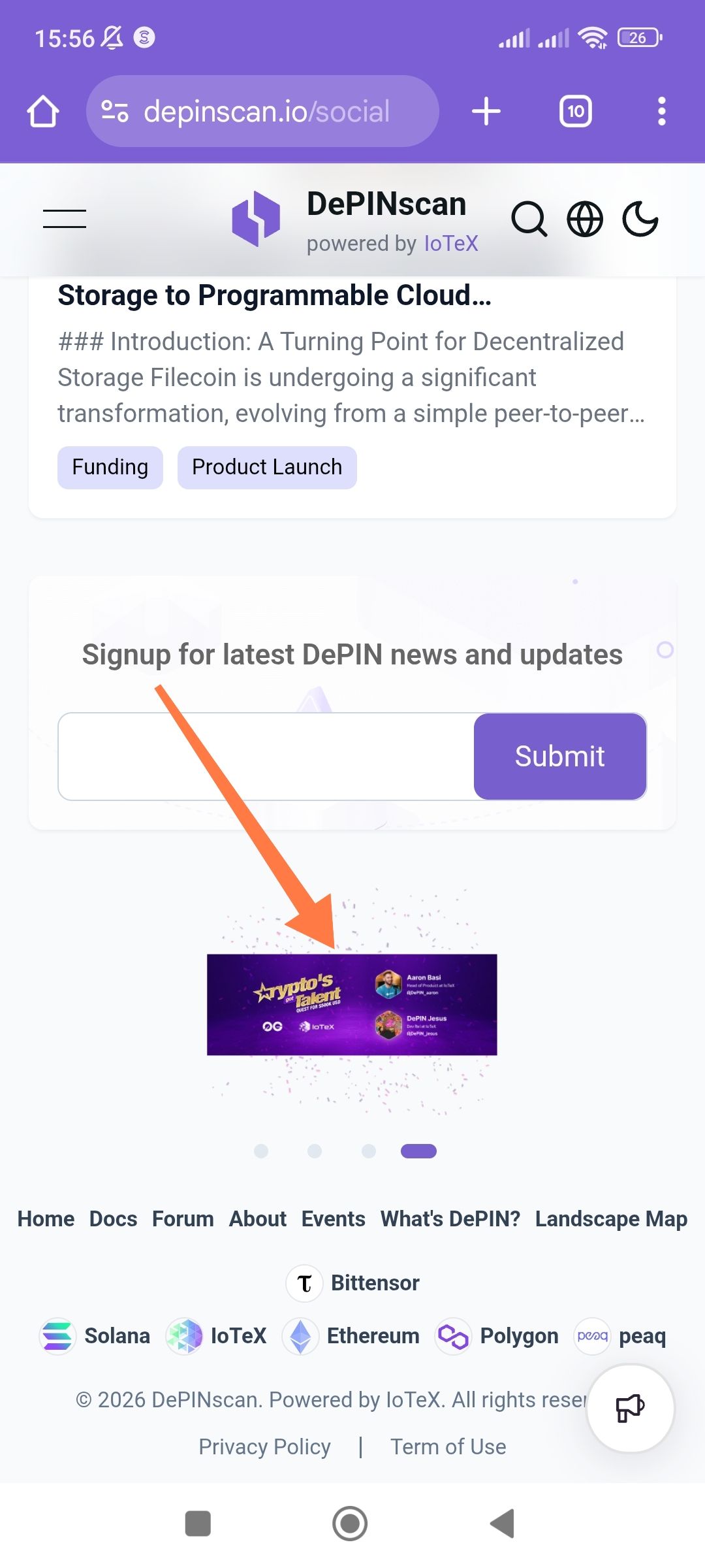
URL: depinscan.io/social
Severity: Low (Visual/UI Consistency)
1. Description
On the social/news section of the mobile site, the carousel/banner image (indicated by the arrow in the screenshot) is significantly undersized and improperly scaled compared to the width of the container. It appears as a small horizontal strip centered in a large white space, creating a poor user experience and making the text within the banner unreadable.
2. Steps to Reproduce
Open a mobile browser (Chrome/Android).
Navigate to
https://depinscan.io/social.Scroll down past the "Signup for latest DePIN news" section.
Observe the carousel/banner image above the footer.
3. Expected Result
The banner image should be responsive, scaling to fill the width of the content container (edge-to-edge or with standard padding) to ensure readability and visual balance.
4. Actual Result
The image is rendered as a small, narrow rectangle with excessive whitespace above and below it, and the pagination dots (carousel indicators) are positioned far below the actual asset.
5. Technical Observations
Aspect Ratio: The image seems to be forced into a fixed height or isn't utilizing
width: 100%.Scaling: The banner content "Crypto's Got Talent" and the profile avatars are too small to be legible on a standard mobile screen.
Recommendation: Adjust the CSS for the carousel container to ensure images utilize object-fit: cover or contain with a width: 100% property, and ensure the container height is dynamic based on the asset’s aspect ratio on mobile viewports.
Wallet Address: io1tkw393kejmxwnd454twc6020sxcyvh5dxqmren
Device & Environment:
-Operating system: Android 13
-Device model: Redmi Note 10 Pro
Please authenticate to join the conversation.
In Review
New Issue
5 months ago

cryptotestnet
Subscribe to post
Get notified by email when there are changes.
In Review
New Issue
5 months ago
cryptotestnet
Subscribe to post
Get notified by email when there are changes.