[ECO Bounty] DePINscan UI Overlap on Highlights Toggle
Overview
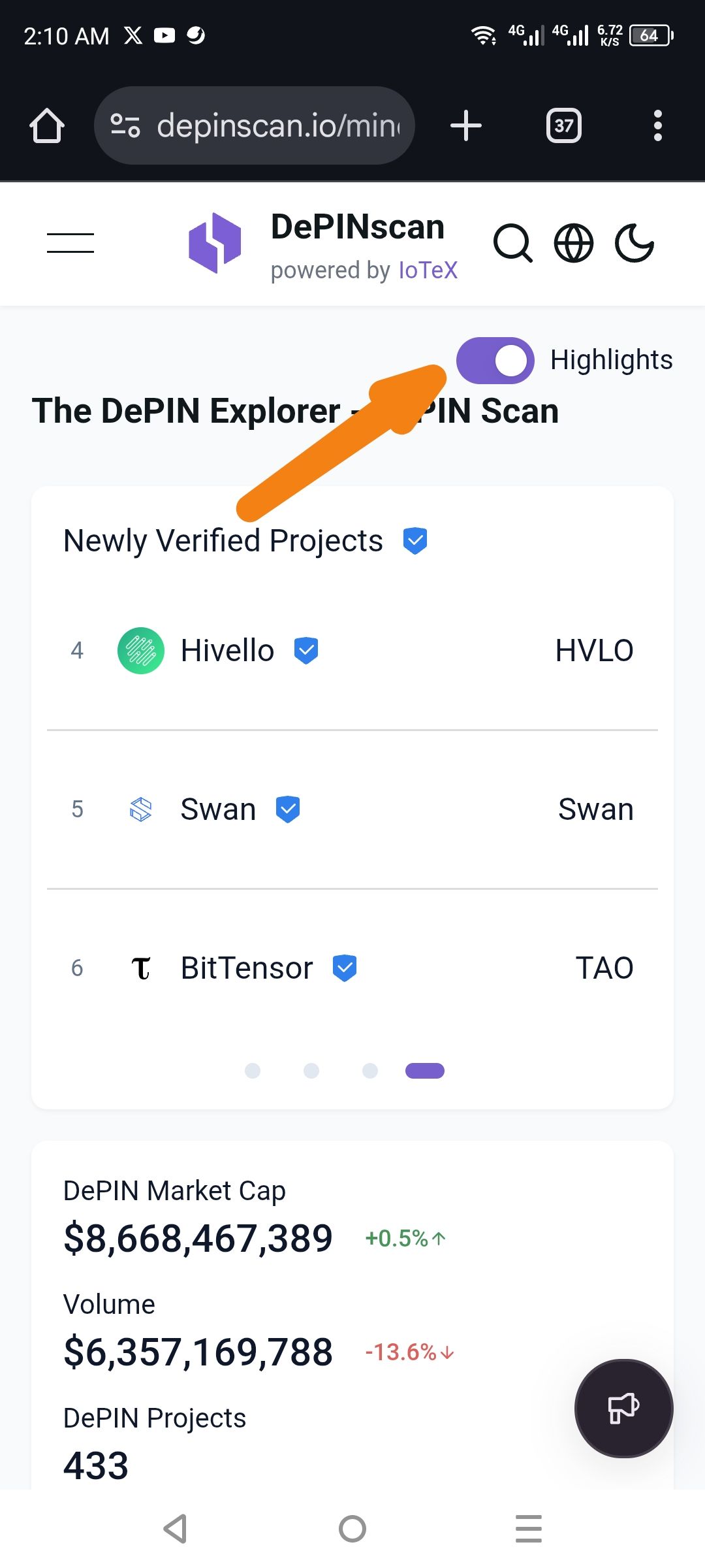
The Highlights toggle switch and its label are overlapping with the main page header text ("The DePIN Explorer..."), making the title difficult to read and creating a cluttered user interface on mobile devices.
Details
Platform: DePINscan (powered by IoTeX)
URL:
depinscan.ioComponent: Highlights Toggle / Header Section
Severity: Low (UI/UX Cosmetic Issue)
Description of Issue
Actual Behavior: The "Highlights" toggle switch is positioned directly over the end of the text "The DePIN Explorer - DePIN Scan".
Expected Behavior: The toggle should be placed in a dedicated sidebar, a new line, or within the header with enough padding to prevent text collision.
Wallet Address: io1tkw393kejmxwnd454twc6020sxcyvh5dxqmren
Device & Environment:
-Operating system: Android 13
-Device model: Redmi Note 10 Pro
Please authenticate to join the conversation.
In Review
New Issue
5 months ago

cryptotestnet
Subscribe to post
Get notified by email when there are changes.
In Review
New Issue
5 months ago
cryptotestnet
Subscribe to post
Get notified by email when there are changes.