[ECO Bounty] Duplicate "Dashboard" Entry in ioTexScan Navigation Menu
Severity: Low
Impact: This is a cosmetic/UI issue that affects the user experience (UX) and visual polish of the site but does not prevent users from accessing explorer features. It may cause minor confusion for new users regarding navigation hierarchy.
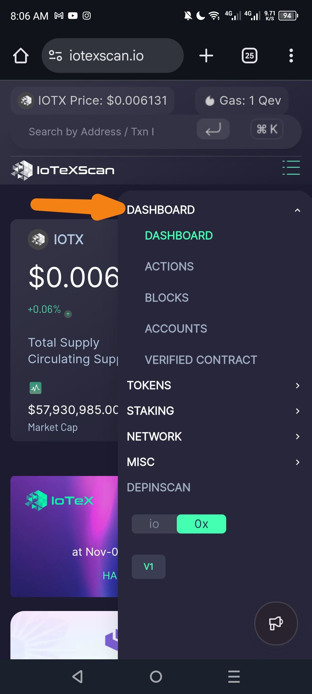
Description: While navigating the ioTexScan website on a mobile device, the side navigation menu (drawer) displays two identical "Dashboard" links. Clicking either link directs the user to the same dashboard page, confirming this is a redundant UI element.
Steps to Reproduce:
Navigate to iotexscan.io using a mobile browser.
Click on the Hamburger Menu (three horizontal lines) in the top navigation bar to open the side drawer.
Observe the list of menu items.
Actual Result: The menu contains two separate "Dashboard" entries listed sequentially or within the same category.
Expected Result: The menu should only contain one "Dashboard" entry to maintain a clean and professional UI.
Wallet Address: io1tkw393kejmxwnd454twc6020sxcyvh5dxqmren
Device & Environment:
-Operating system: Android 13
-Device model: Redmi Note 10 Pro
Please authenticate to join the conversation.
In Review
New Issue
5 months ago

cryptotestnet
Subscribe to post
Get notified by email when there are changes.
In Review
New Issue
5 months ago
cryptotestnet
Subscribe to post
Get notified by email when there are changes.