[Eco Bounty] ioPay About Page – Oversized Spacing / Layout Issue
Issue Summary:
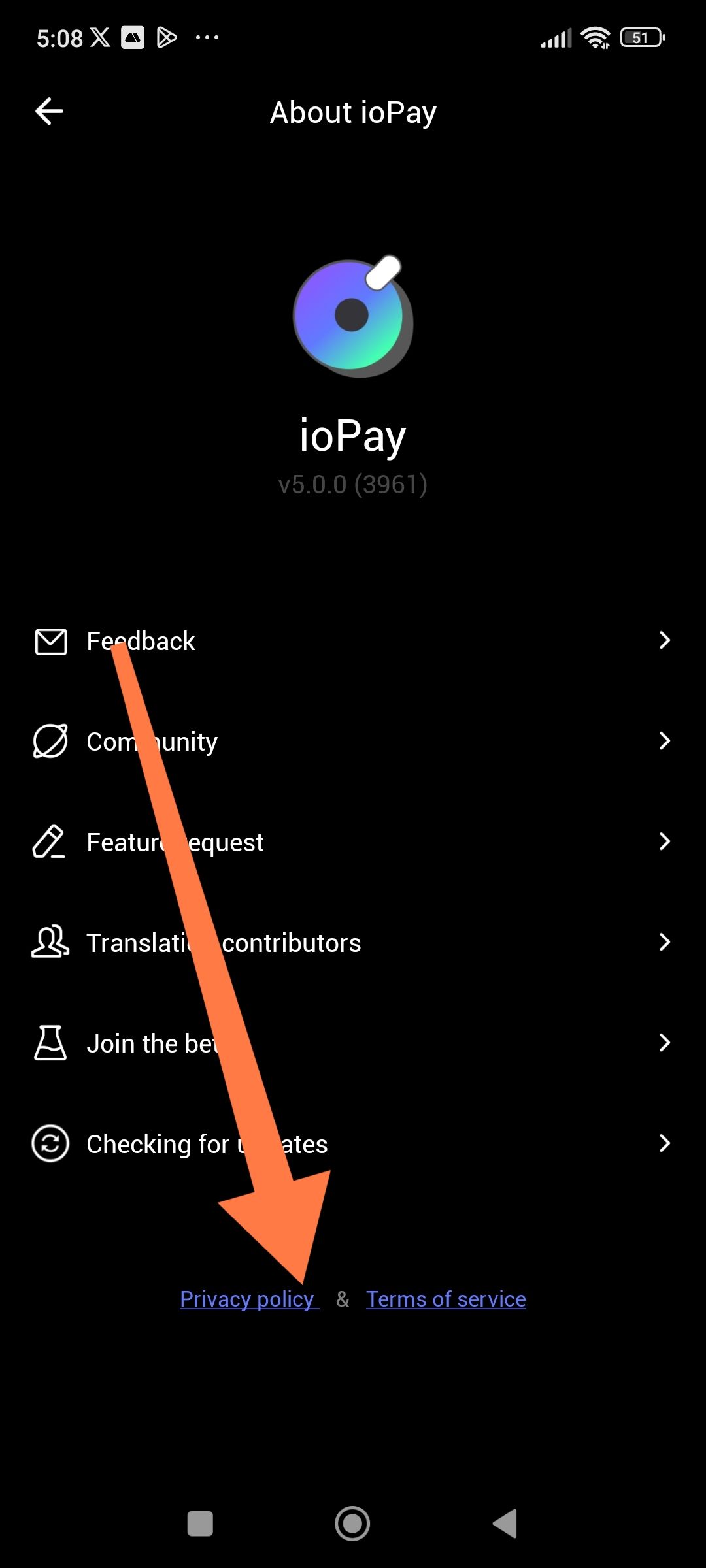
Excessive empty space (overspace) on the About ioPay page near Privacy Policy & Terms of Service.
Description:
On the About ioPay screen, there is a noticeable oversized empty space at the bottom of the page before the Privacy Policy and Terms of Service links. This makes the layout look unbalanced and unfinished.
Steps to Reproduce:
Open ioPay Wallet
Go to Settings / About ioPay
Scroll to the bottom of the page
Expected Result:
Proper spacing and alignment
Privacy Policy & Terms of Service positioned consistently with the rest of the menu
Actual Result:
Large unused empty space appears
Privacy Policy & Terms of Service look detached from the main content
Impact:
Poor UI/UX appearance
Screen space is wasted
Page looks visually unpolished
Additional Notes:
Reducing bottom padding or aligning the links with the rest of the layout would improve visual consistency.
Wallet Address: io1tkw393kejmxwnd454twc6020sxcyvh5dxqmren
Device & Environment:
-Operating system: Windows 11 Pro
-Device model: A520MHP
Please authenticate to join the conversation.
In Progress
New Issue
7 months ago

cryptotestnet
Subscribe to post
Get notified by email when there are changes.
In Progress
New Issue
7 months ago
cryptotestnet
Subscribe to post
Get notified by email when there are changes.