[ECO Bounty] iopay Awkward Text Wrapping in Security Banner
Summary
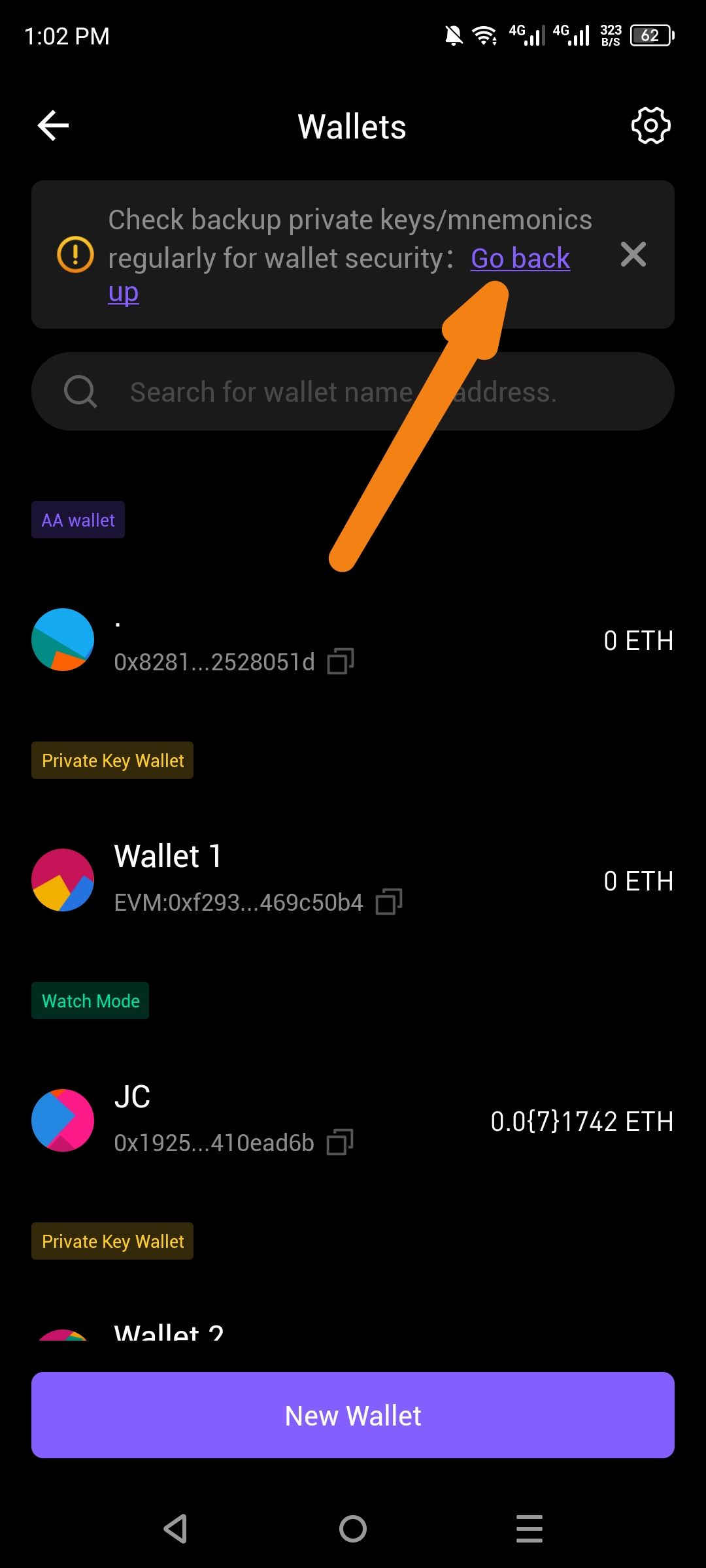
The security reminder banner on the Wallets screen contains a hyperlink with awkward text wrapping. The phrase "Go back up" is split across two lines ("Go back" on the first line, "up" on the second), which looks unprofessional and can be confusing to users.
Steps to Reproduce
Open the ioPay app.
Navigate to the Wallets screen (accessible from the bottom navigation or settings).
If a wallet is not backed up, or the reminder is triggered, observe the yellow/orange warning banner at the top.
Notice the text formatting of the "Go back up" action link.
Expected Behavior
The hyperlink text should display on a single line without awkward line breaks, or the wording should be adjusted to prevent orphaned words. Options:
Display as: "Go back up" (single line)
Or adjust wording to: "Back up now" or "Backup wallet" to avoid wrapping issues
Actual Behavior
The text "Go back up" is wrapped mid-phrase:
Line 1: "Go back"
Line 2: "up"
This creates poor readability and visual inconsistency. The word "up" appears isolated on the second line, which looks like a layout error.
Suggested Fix
Option A (Preferred): Apply CSS style
white-space: nowrapto the hyperlink element to prevent text wrapping.Option B: Change the link text to a shorter phrase like "Back up now" or "Backup now" that fits on one line.
Option C: Increase the available width for the banner text or adjust container padding to accommodate the full phrase.
Wallet Address: io1tkw393kejmxwnd454twc6020sxcyvh5dxqmren
Device & Environment:
-Operating system: Android 13
-Device model: Redmi Note 10 Pro
Please authenticate to join the conversation.
In Review
New Issue
5 months ago

cryptotestnet
Subscribe to post
Get notified by email when there are changes.
In Review
New Issue
5 months ago
cryptotestnet
Subscribe to post
Get notified by email when there are changes.