[Eco Bounty] ioPay IoTexScan UI Elements Overlapping and Lack of Padding in Landscape Mode
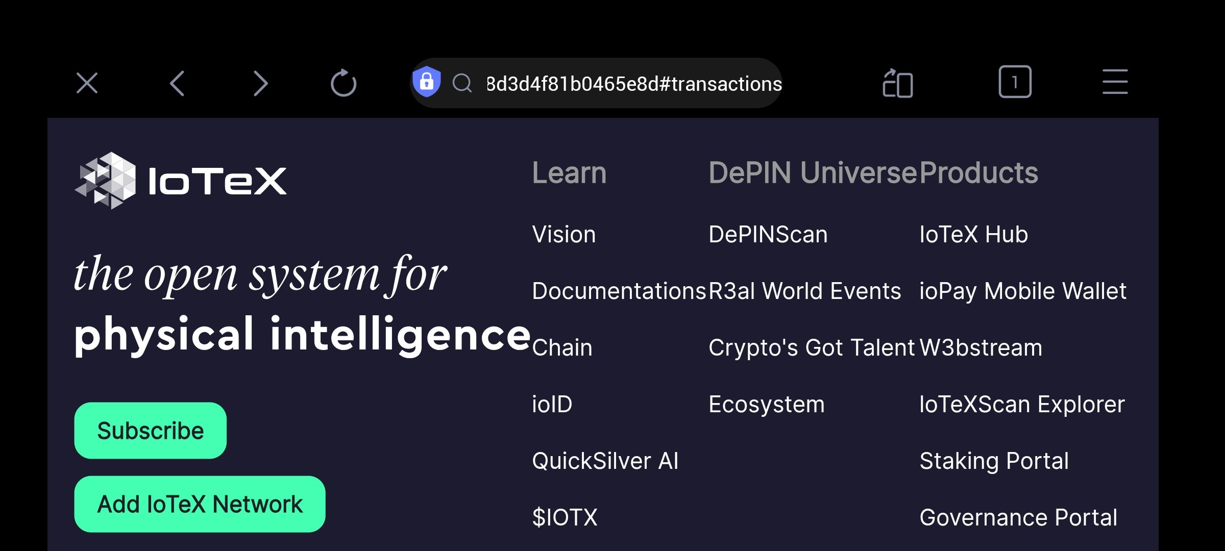
Description: The user interface on the IoTeXScan explorer displays significant layout issues when viewed in landscape mode within the ioPay in-app browser. Text columns and navigation elements are overlapping or tightly packed, indicating a lack of proper spacing and responsive padding.
Steps to Reproduce:
Open a transaction or the IoTeX ecosystem page within the ioPay app browser.
Rotate the device to landscape mode.
Observe the "Learn," "DePIN Universe," and "Products" columns.
Expected Behavior: The UI should be responsive, providing adequate white space between text columns and ensuring that headers do not overlap with list items for better readability.
Actual Behavior:
Overlapping Text: The "DePIN Universe" header is partially overlapping with the "Products" column.
Missing Padding: The list items (e.g., "R3al World Events," "ioPay Mobile Wallet") are cramped together without horizontal gutter space.
Alignment Issues: The text columns are colliding, making the navigation links difficult to read and tap accurately.
Suggested Fix:
Increase the horizontal padding/margins between grid columns in the CSS media queries for desktop/landscape views.
Implement a
gapproperty in the flexbox or grid container to prevent text collision.Ensure the container has a maximum width or responsive scaling to maintain legibility on wider screens.
Wallet Address: io1tkw393kejmxwnd454twc6020sxcyvh5dxqmren
Device & Environment:
-Operating system: Android 13
-Device model: Redmi Note 10 Pro
Please authenticate to join the conversation.
In Review
New Issue
6 months ago

cryptotestnet
Subscribe to post
Get notified by email when there are changes.
In Review
New Issue
6 months ago
cryptotestnet
Subscribe to post
Get notified by email when there are changes.