[ECO Bounty] ioPay Missing Leading Icons in Settings Menu
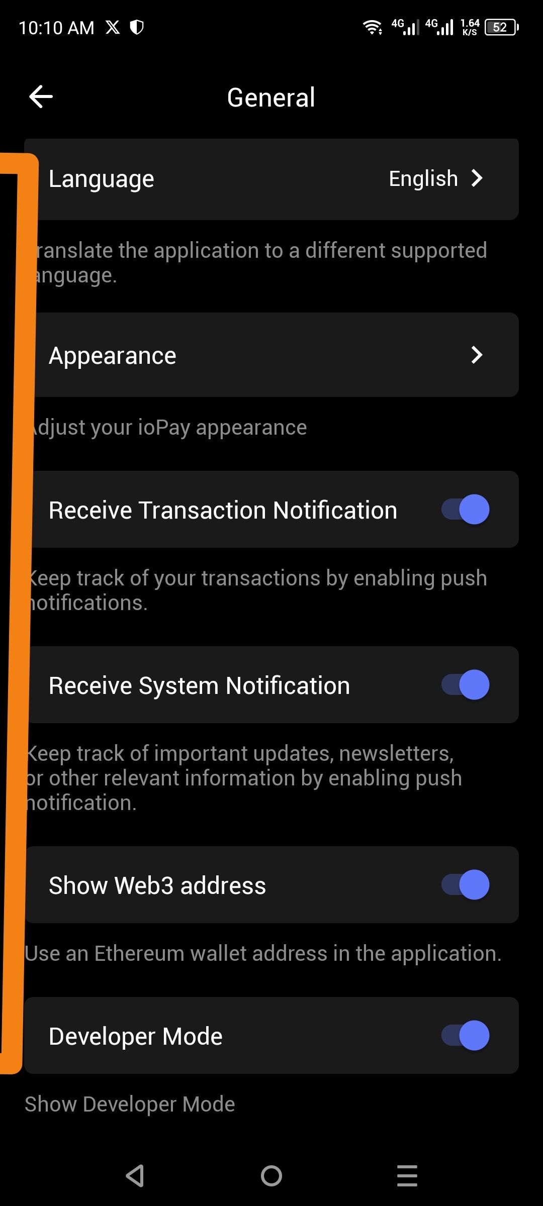
Description: The General settings page displays list items (e.g., Language, Appearance, Receive Transaction Notification) as plain text rows without accompanying icons. Adding distinct icons would improve visual hierarchy, scannability, and align the app with modern mobile UX standards where settings categories are typically paired with intuitive iconography.
Steps to Reproduce:
Open the ioPay mobile application.
Navigate to Settings > General.
Observe the list of settings options.
Expected Result: Each settings row should display a relevant icon on the left side to visually represent the category, for example:
Language: Globe or translate icon 🌐
Appearance: Palette or moon/sun icon 🎨
Notifications: Bell icon 🔔
Web3 Address: Wallet or ETH icon
Developer Mode: Code brackets icon </>
Actual Result: The settings rows contain only text labels and toggle switches, with empty space on the left side (as indicated by the orange marker). This creates a visually sparse interface and makes it harder to quickly locate specific settings.
Environment Details:
Wallet: ioPay Mobile
Page: Settings → General
Items Affected: Language, Appearance, Receive Transaction Notification, Receive System Notification, Show Web3 address, Developer Mode.
Suggested Fix: Add standard iconography to the leading edge of each settings row. These should be simple, outlined icons that match the app's dark theme aesthetic, improving the information architecture and user experience.
Wallet Address: io1tkw393kejmxwnd454twc6020sxcyvh5dxqmren
Device & Environment:
-Operating system: Android 13
-Device model: Redmi Note 10 Pro
Please authenticate to join the conversation.
In Review
New Issue
5 months ago

cryptotestnet
Subscribe to post
Get notified by email when there are changes.
In Review
New Issue
5 months ago
cryptotestnet
Subscribe to post
Get notified by email when there are changes.