[ECO Bounty] ioPay Mobile App - "Tips" Modal Missing Visual Assets & Design Polish
App: ioPay Mobile Wallet (Android)
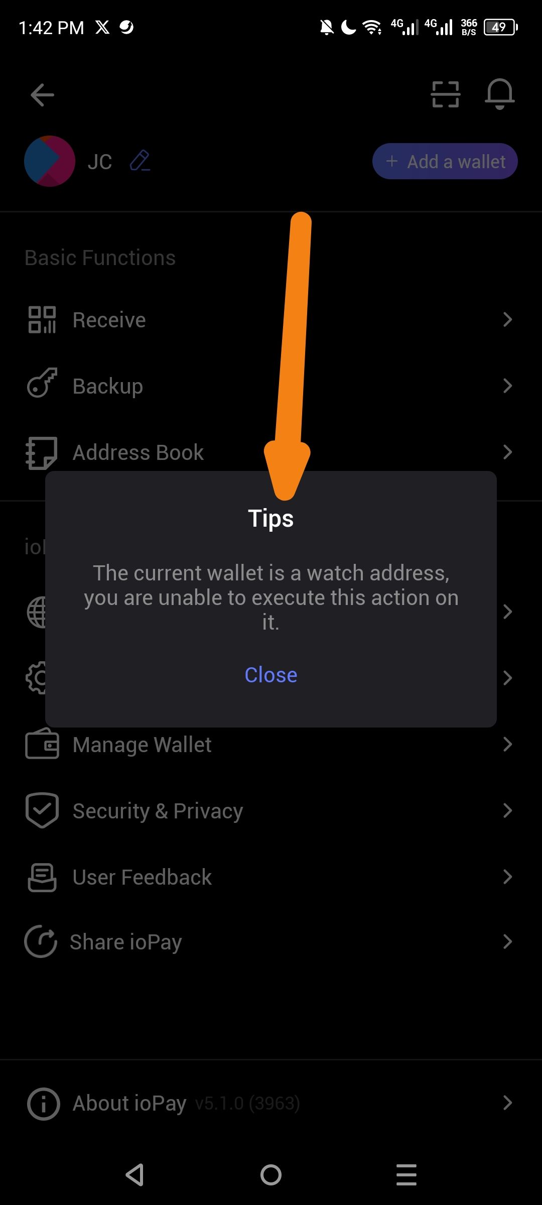
Version: v5.1.0 (Build 3963) - visible in screenshot
Severity: Low-Medium (UI/UX Polish)
Description: The "Tips" modal/dialog that appears when attempting restricted actions on a watch-only wallet is visually incomplete. It displays as a plain text box without any accompanying icon, warning symbol, or branded visual element, resulting in a jarring user experience that appears unfinished compared to other app screens.
Steps to Reproduce:
Open ioPay app (v5.1.0)
Navigate to a watch-only wallet (imported address without private key)
Attempt to execute an action requiring signing (Backup)
Observe the "Tips" warning modal that appears
Current Issues:
Missing Icon/Image: The modal has no visual indicator (no warning icon, info icon, or illustration) to immediately convey the nature of the message
Plain Design: Appears as a simple dark rectangle with basic text — inconsistent with the app's otherwise polished card-based UI design
Generic Title: Uses generic "Tips" heading instead of more descriptive "Watch Address" or "Action Unavailable"
Alignment: Modal appears slightly off-center or inconsistent with standard iOS/Android dialog patterns
Expected Result:
Visual Indicator: Include a warning/info icon (e.g., eye icon for "watch only" or alert triangle) at the top of the modal
Enhanced Styling: Use consistent card design with proper padding, rounded corners, and brand color accents
Better Copy: Change title from generic "Tips" to "Watch Address Restricted" or similar
Iconography: Consider adding the watch-only icon (eye symbol) to reinforce the wallet type
Environment:
Device: Android Mobile
App Version: v5.1.0 (3963)
Screen: Wallet settings/management interface
Suggested Fix:
Add a 48-64px icon at the top of the modal (warning or eye/watch icon)
Apply consistent shadow/elevation styling matching other modals in the app
Update title to be more descriptive of the restriction
Ensure proper padding and text alignment per Material Design 3 or iOS Human Interface Guidelines
Screenshot Evidence:
Modal shows: Title "Tips" + message text + "Close" button only
No visual hierarchy or iconography present
Arrow indicates the plain header area where an icon should be
Wallet Address: io1tkw393kejmxwnd454twc6020sxcyvh5dxqmren
Device & Environment:
-Operating system: Android 13
-Device model: Redmi Note 10 Pro
Please authenticate to join the conversation.
In Review
New Issue
5 months ago

cryptotestnet
Subscribe to post
Get notified by email when there are changes.
In Review
New Issue
5 months ago
cryptotestnet
Subscribe to post
Get notified by email when there are changes.