[ECO Bounty] iopay News Feed Pagination UI Design Issue
Summary
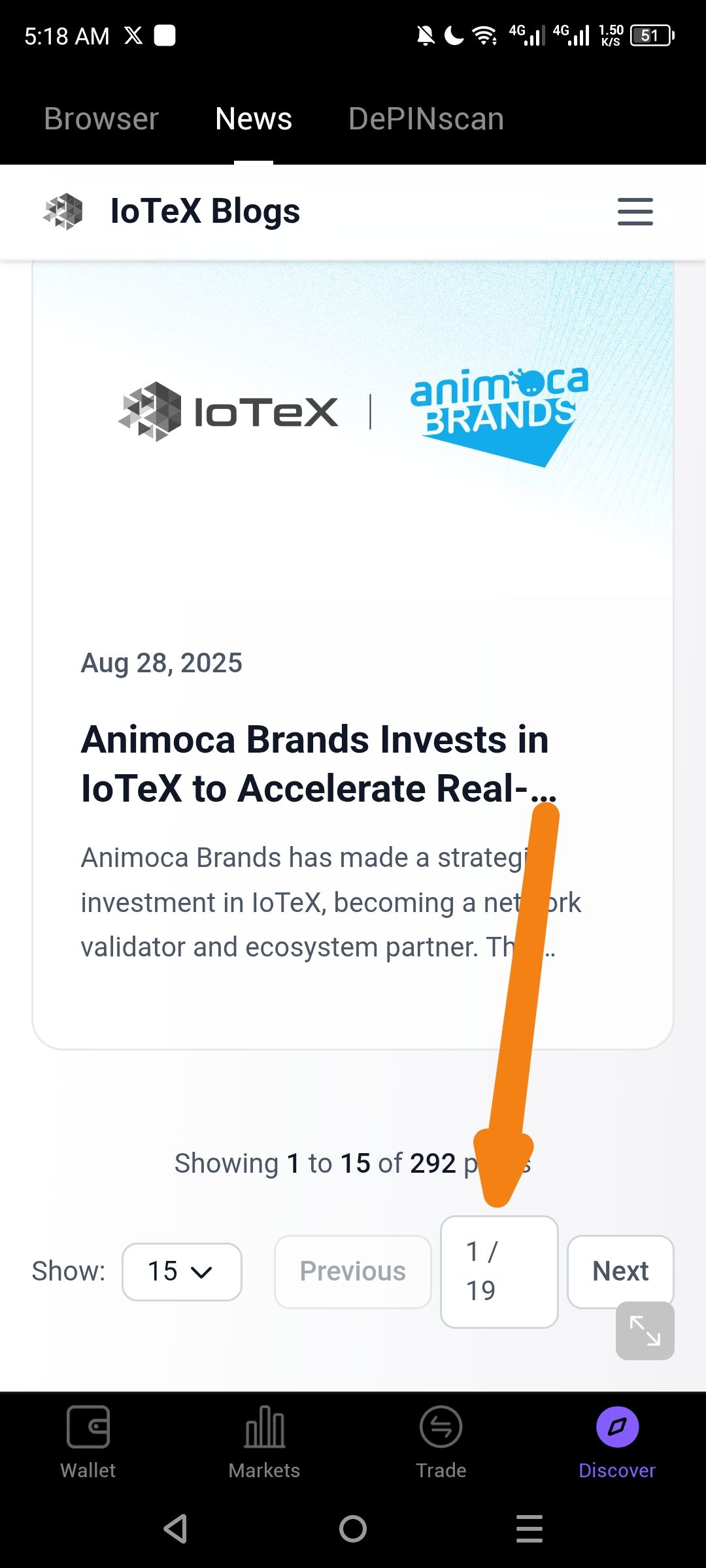
The page indicator (e.g., "1 / 19") in the ioPay News section exhibits design inconsistencies that hinder readability and user navigation.
Steps to Reproduce
Open the ioPay application.
Navigate to the News or Discover section.
Locate the pagination indicator (the text showing 1 / 19) at the bottom or top of the news feed.
Observe the alignment, font size, and padding relative to the news cards.
Suggested Fix
Alignment: Center the pagination element horizontally.
Interactivity: Make the "1 / 19" area a clickable "Jump to Page" input or ensure it clearly distinguishes between the current page and the total.
Visual Hierarchy: Use a slightly bolder weight for the current page (e.g., 1 / 19) to improve focus.
Wallet Address: io1tkw393kejmxwnd454twc6020sxcyvh5dxqmren
Device & Environment:
-Operating system: Android 13
-Device model: Redmi Note 10 Pro
Please authenticate to join the conversation.
In Review
New Issue
6 months ago

cryptotestnet
Subscribe to post
Get notified by email when there are changes.
In Review
New Issue
6 months ago
cryptotestnet
Subscribe to post
Get notified by email when there are changes.