[ECO Bounty] iopay Non-Modern UI Components in Main Wallet Dashboard
Description
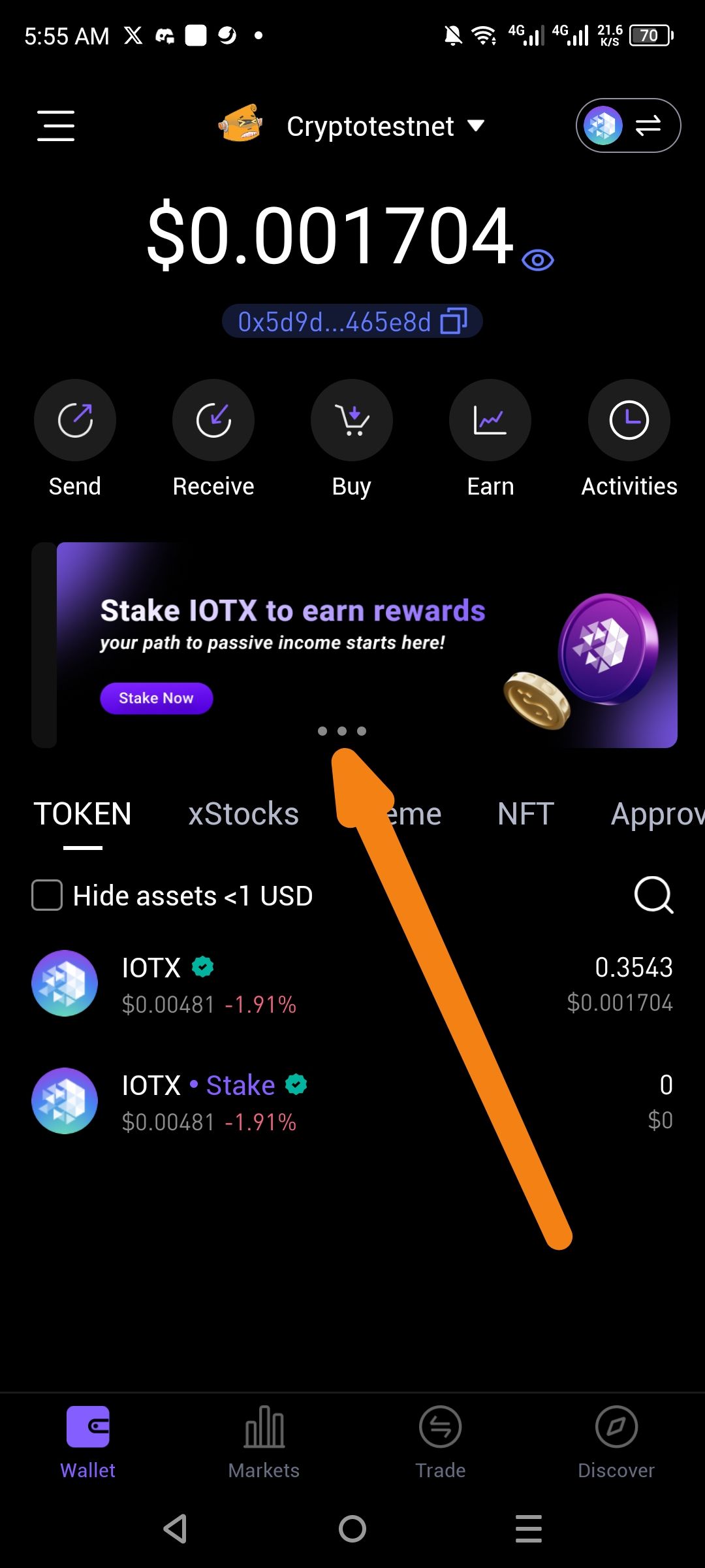
The main wallet dashboard in ioPay contains several UI elements that do not align with modern mobile design standards. Specifically, the pagination indicator (the three dots below the "Stake IOTX" banner) and the asset filter section ("Hide assets < 1 USD") use basic, legacy styling that feels disconnected from the more polished IOTX branding and icons used elsewhere in the app.
Severity
Low — This is a visual/cosmetic issue that does not impact the functionality of sending, receiving, or staking assets.
Impact
Visual Inconsistency: The app's design language is a mix of high-fidelity graphics (like the 3D staking coins) and basic, low-fidelity UI components (like the standard checkbox and small gray pagination dots).
Brand Perception: An "unpolished" UI can make the app feel less premium or secure to new users compared to modern competitors like MetaMask or Phantom.
User Experience: The "Hide assets" checkbox is small and may be difficult for users with larger fingers to toggle accurately on mobile devices.
Reproduce
Open the ioPay app to the main Wallet tab.
Observe the banner section (carousel). Note the small, static gray dots used for navigation.
Scroll down to the TOKEN list.
Observe the "Hide assets < 1 USD" toggle, which uses a standard, sharp-cornered system checkbox.
Expectation
Carousel Indicators: Should use modern active/inactive states (e.g., the active dot expanding into a pill shape or changing to a bright brand color).
Toggles: The legacy checkbox should be replaced with a modern "Switch" component or a custom-styled rounded checkbox that matches the app's dark-mode aesthetic.
Typography & Spacing: The layout should feel more "spacious" with consistent corner radii across all cards and interactive elements.
Actual
The app uses "stock" or legacy UI components that appear dated and lack the smooth animations or refined styling found in modern Web3 applications.
Suggested Fix
Modernize Toggles: Replace the standard HTML-style checkbox for "Hide assets" with a sleek UI toggle switch.
Update Pagination: Implement dynamic carousel indicators that provide better visual feedback on which slide is currently active.
Refine the Banner: Add a subtle gradient border or "glassmorphism" effect to the Stake banner to help it blend more naturally into the dark background of the wallet.
Wallet Address: io1tkw393kejmxwnd454twc6020sxcyvh5dxqmren
Device & Environment:
-Operating system: Android 13
-Device model: Redmi Note 10 Pro
Please authenticate to join the conversation.
In Review
New Issue
5 months ago

cryptotestnet
Subscribe to post
Get notified by email when there are changes.
In Review
New Issue
5 months ago
cryptotestnet
Subscribe to post
Get notified by email when there are changes.