[ECO Bounty] ioTex Hub “My Stakes” page – UI text truncation and layout overlap issues
Description
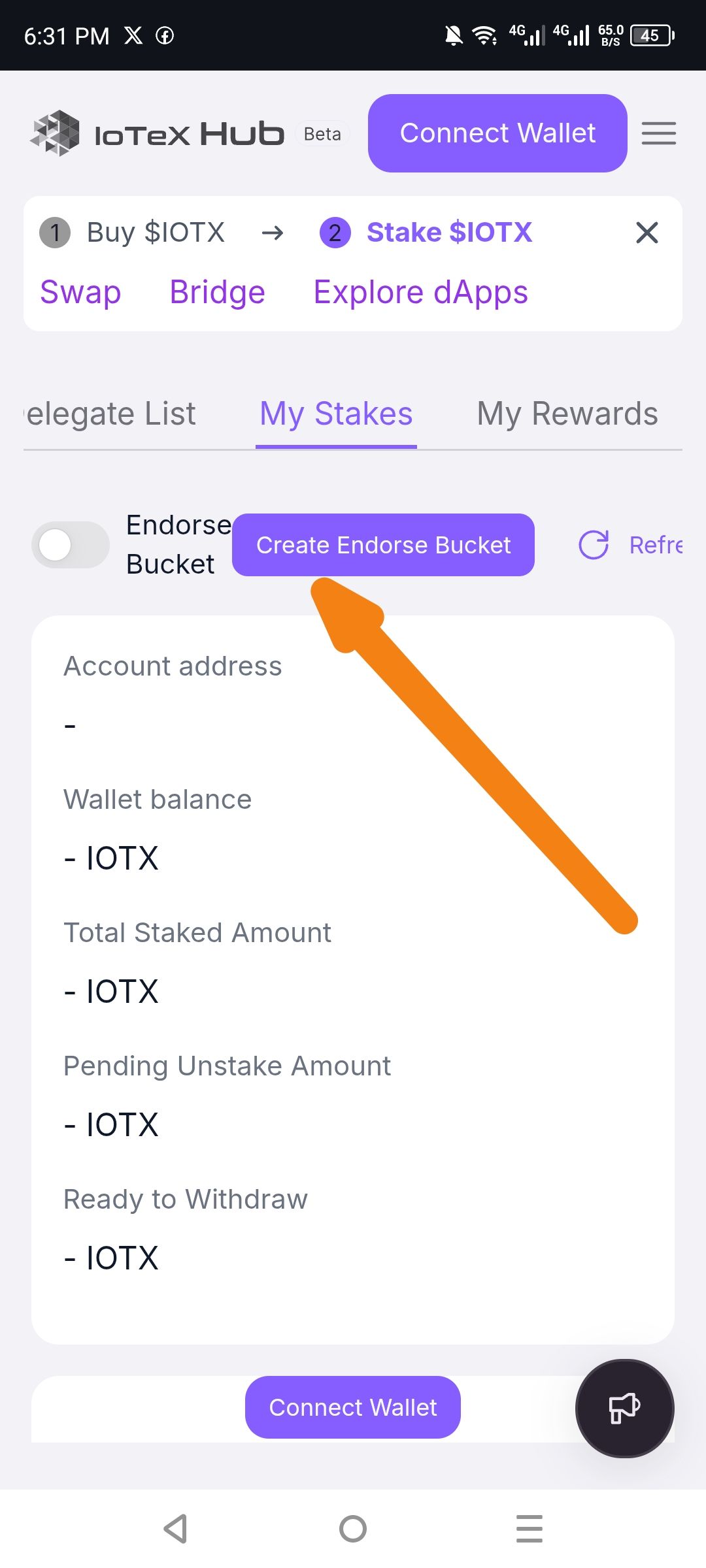
On the “My Stakes” tab, several UI elements are truncated or overlapping due to insufficient container width or padding:
Endorse Bucket row: The toggle switch and “Create Endorse Bucket” button overlap or are positioned too closely, causing the toggle to be partially cut off on the left edge.
Steps to Reproduce
Open IoTeX Hub Beta on an Android device.
Navigate to the “Stake $IOTX” section (step 2 in the top flow indicator).
Ensure you are on the “My Stakes” tab.
Observe the column headers and the “Endorse Bucket” row.
Expected Result
• All text labels should be fully visible without truncation.
• The toggle switch and “Create Endorse Bucket” button should have adequate spacing/padding so neither element is clipped or overlapping.
Actual Result
• The “Endorse Bucket” toggle is partially obscured/cut off on the left side and sits too close to the purple “Create Endorse Bucket” button.
Suggested Fix
• Increase horizontal padding or minimum width for tab labels to prevent text truncation.
• Adjust flex/grid layout for the “Endorse Bucket” row to ensure the toggle retains adequate left margin and does not overlap with the action button.
Severity / Priority
Medium – UI readability issue that affects user comprehension, though functionality remains accessible.
Wallet Address: io1tkw393kejmxwnd454twc6020sxcyvh5dxqmren
Device & Environment:
-Operating system: Android 13
-Device model: Redmi Note 10 Pro
Please authenticate to join the conversation.
In Review
New Issue
5 months ago

cryptotestnet
Subscribe to post
Get notified by email when there are changes.
In Review
New Issue
5 months ago
cryptotestnet
Subscribe to post
Get notified by email when there are changes.