[ECO Bounty] ioTex Hub Redundant "Connect Wallet" UI Elements
1. Summary
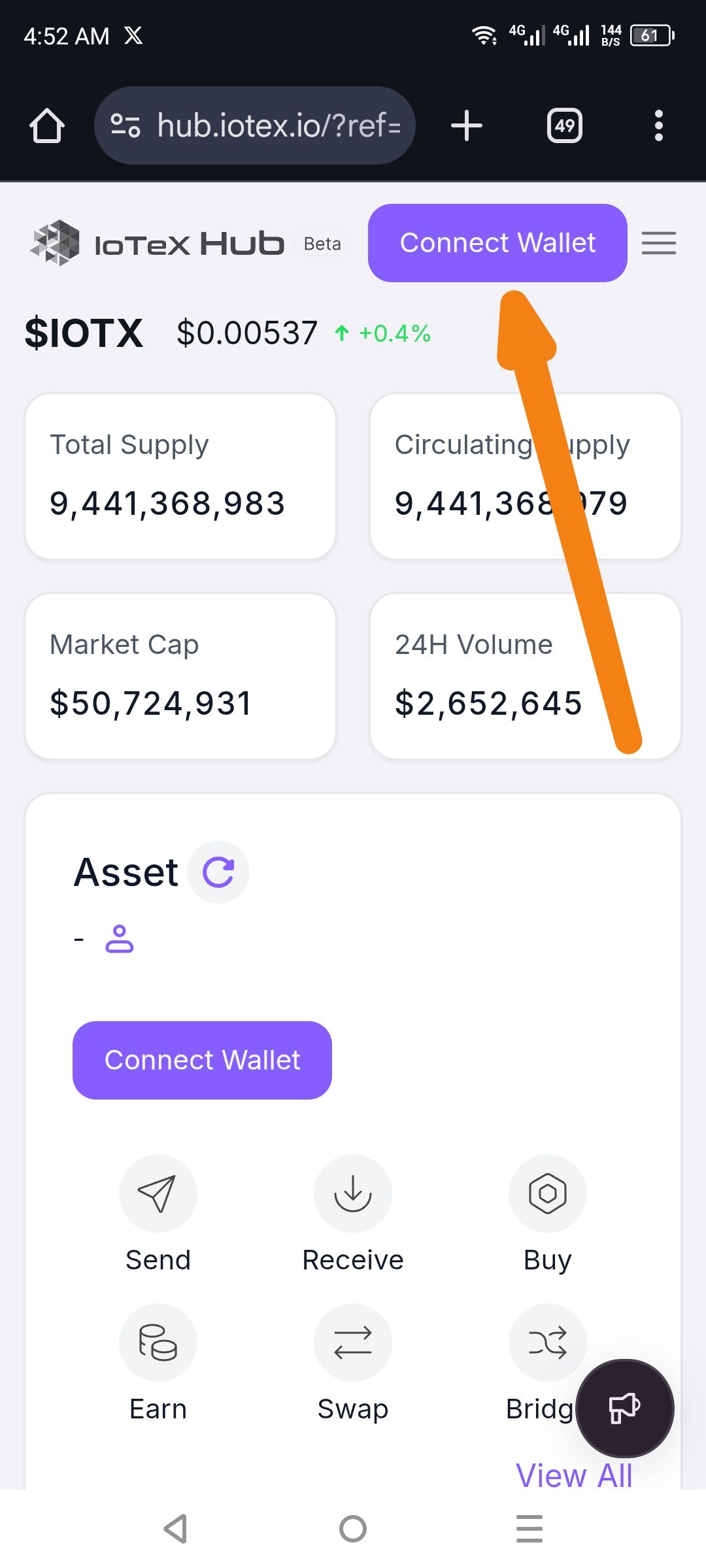
The landing page of the IoTeX Hub displays two identical "Connect Wallet" call-to-action (CTA) buttons simultaneously within the same screen view. One is located in the global navigation header, and the other is centered within the "Asset" dashboard section.
2. Environment
URL:
hub.iotex.ioDevice: Android / Mobile Browser
Screen Resolution: High aspect ratio (e.g., 1080x2400)
3. Steps to Reproduce
Open a mobile browser and navigate to
hub.iotex.io.Ensure you are not currently logged in or have not connected a wallet.
Observe the top header and the main content area (Asset section).
4. Expected Result
The interface should ideally have one primary CTA to connect a wallet to avoid user friction. Standard practice is to keep the button in the Header for global access, while the "Asset" section should display a placeholder or a more subtle prompt.
5. Actual Result
Two identical purple "Connect Wallet" buttons are visible at once, creating visual noise and a redundant user path.
6. Visual Evidence
(See the provided screenshot showing the header button and the asset section button.)
Suggested Fix
Option A: Hide the "Connect Wallet" button in the Asset section if the header button is already visible.
Option B: Replace the Asset section button with a "Login to view assets" text link to differentiate it from the primary global action in the header.
Wallet Address: io1tkw393kejmxwnd454twc6020sxcyvh5dxqmren
Device & Environment:
-Operating system: Android 13
-Device model: Redmi Note 10 Pro
Please authenticate to join the conversation.
In Review
New Issue
5 months ago

cryptotestnet
Subscribe to post
Get notified by email when there are changes.
In Review
New Issue
5 months ago
cryptotestnet
Subscribe to post
Get notified by email when there are changes.