[ECO Bounty] : IoTeX Landing Page - Content Overlap / Z-Index Issue
URL: https://iotex.io (under the "what we build" section)
Severity: Medium (Visual/Readability issue)
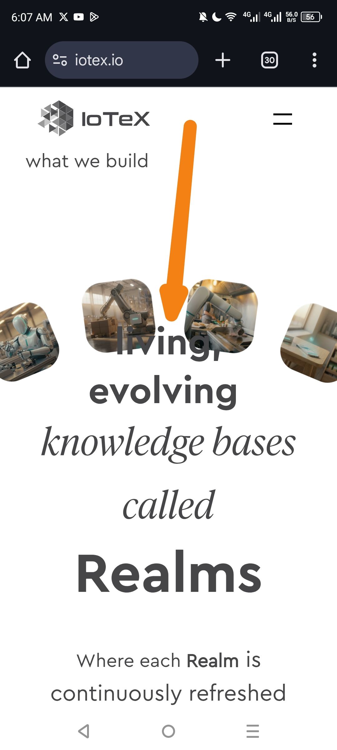
Description: On the mobile version of the IoTeX landing page, specifically within the "what we build" section describing Realms, the heading text "living," is overlapping with the floating image/icon elements in the background. This makes the primary headline difficult to read and looks unprofessional.
Steps to Reproduce:
Navigate to https://iotex.io on a mobile device or using mobile emulation in a desktop browser.
Scroll down to the "what we build" section.
Observe the text "living, evolving knowledge bases called Realms".
Expected Result: The text should be clearly separated from background images, either by having a higher z-index with a background blur, or by adjusting the responsive padding/margin so that images and text do not collide.
Actual Result: The word "living," (pointed to by the arrow in the screenshot) is directly obscured by two floating images (robotic arms), creating a collision between the foreground text and background assets.
Environment:
Platform: Mobile (Android)
Browser: Chrome Mobile
Device: Mobile Viewport (Portrait)
Suggested Fix:
CSS Adjustment: Increase the vertical margin or padding between the "what we build" header and the image carousel.
Z-Index/Layering: Ensure the text has a higher
z-indexand perhaps a slight text-shadow or a solid background wrapper to maintain legibility if overlap is intentional for the design.Responsive Layout: Adjust the scale of the background images for smaller screen widths to prevent them from centering behind the main text.
Wallet Address: io1tkw393kejmxwnd454twc6020sxcyvh5dxqmren
Device & Environment:
-Operating system: Windows 11 Pro
-Device model: Redmi Note 10 Pro
Please authenticate to join the conversation.
In Review
New Issue
5 months ago

cryptotestnet
Subscribe to post
Get notified by email when there are changes.
In Review
New Issue
5 months ago
cryptotestnet
Subscribe to post
Get notified by email when there are changes.