[ECO Bounty] IoTeX Website - Excessive Whitespace in Press Cards
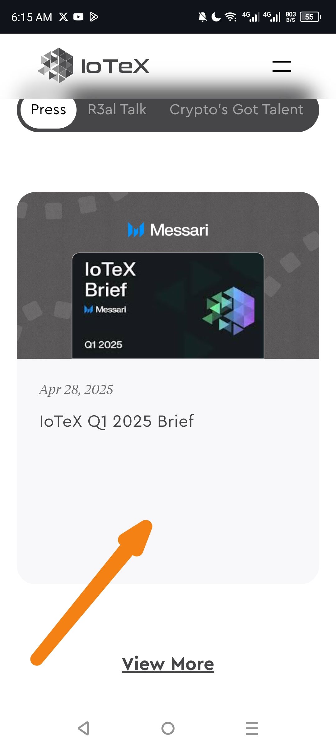
Description: The content cards within the "Press" tab exhibit poor space utilization on mobile devices. There is a significant amount of empty vertical space between the article title ("IoTeX Q1 2025 Brief") and the "View More" link/bottom of the card.
Steps to Reproduce:
Navigate to the IoTeX website on a mobile device.
Go to the media/news section and select the "Press" filter.
Observe the layout of the individual press cards.
Expected Result: Cards should be vertically compact, with the card height dynamically adjusting to the content size or having consistent, balanced padding.
Actual Result: As indicated by the arrow in the screenshot, there is a large "dead zone" of whitespace below the text. This forces users to scroll more than necessary to see subsequent items and gives the interface an unfinished appearance.
Environment:
Platform: Mobile (Android)
Browser: Chrome Mobile
Section: Press Filter
Suggested Fix:
Adjust the CSS for the press card container to use
height: autoormin-heightinstead of a fixed height.Reduce the bottom padding of the card body to ensure the "View More" button or card footer sits closer to the actual content.
Wallet Address: io1tkw393kejmxwnd454twc6020sxcyvh5dxqmren
Device & Environment:
-Operating system: Android 13
-Device model: Redmi Note 10 Pro
Please authenticate to join the conversation.
In Review
New Issue
5 months ago

cryptotestnet
Subscribe to post
Get notified by email when there are changes.
In Review
New Issue
5 months ago
cryptotestnet
Subscribe to post
Get notified by email when there are changes.