[ECO Bounty] IoTeX Website - Sub-Header / Logo Visibility Issue on Scroll
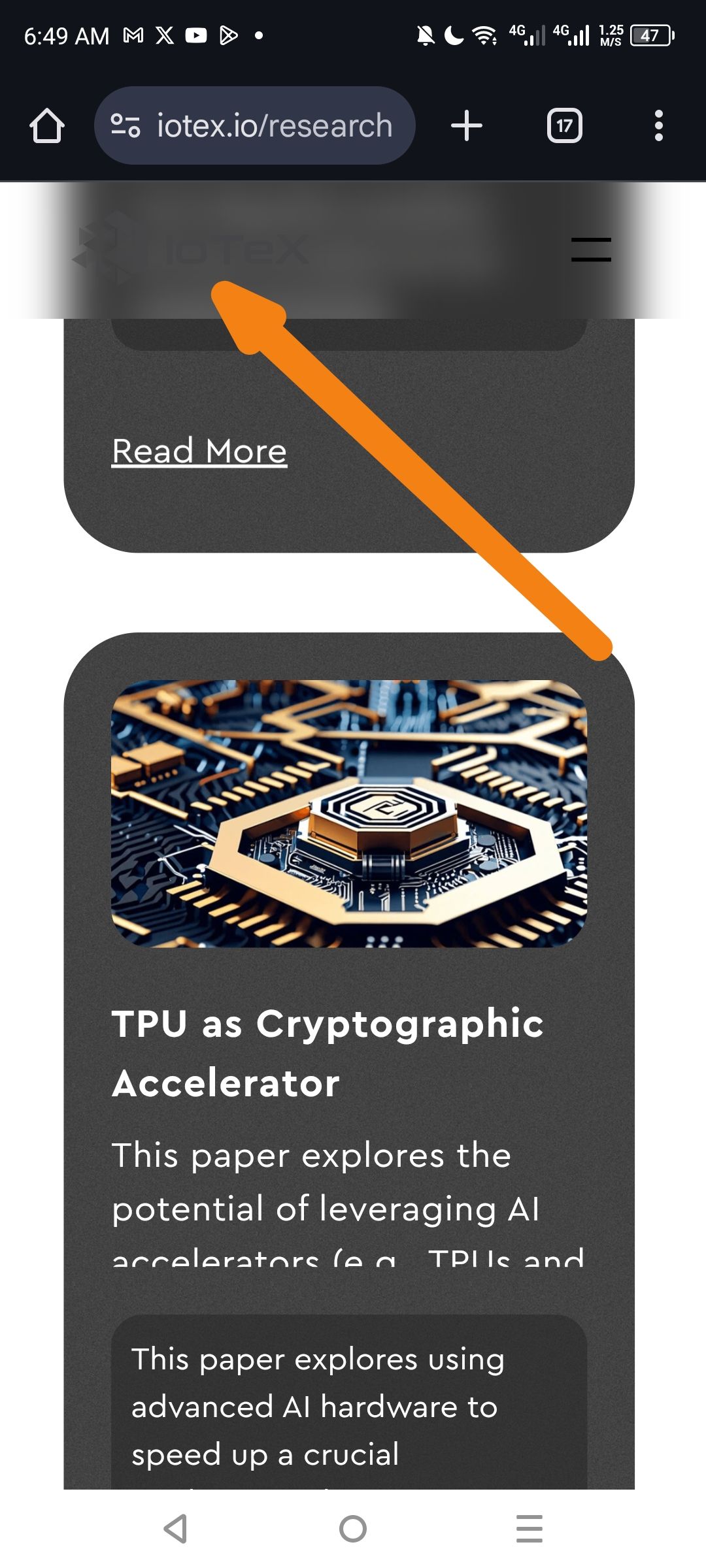
Description: When scrolling down the page on mobile, the sticky header (which allows users to navigate or return home) contains a version of the IoTeX logo that lacks sufficient contrast against the header background. Specifically, the "IoTeX" brand text becomes practically invisible, while only the hamburger menu remains clearly identifiable.
Steps to Reproduce:
Navigate to https://iotex.io/research on a mobile device
Scroll down until the sticky header (sub-header) activates
Observe the left side of the header where the brand logo is located
Expected Result: The IoTeX logo and brand text should remain clearly visible at all times, regardless of background changes or scroll position, to maintain brand identity and provide a clear "Home" navigation link.
Actual Result: As indicated by the arrow in the screenshot, the "IoTeX" logo/text is obscured by a blurred/dark overlay or is using a color that matches the sticky header background too closely. Only the hamburger menu icon (three lines) is clearly visible on the right.
Environment:
Platform: Mobile (Android)
Browser: Chrome Mobile
Device: Mobile Viewport
Affected Pages: /research (likely sitewide behavior for dark theme sections)
Suggested Fix:
Invert Logo Color: Use a white/light version of the logo for the sticky header when it is displayed over dark content or a darkened header bar
Adjust Header Background: Reduce the opacity of the blur/overlay or ensure the header background provides sufficient contrast per WCAG accessibility standards
CSS Check: Verify that the logo image doesn't have a
filter: opacity(...)orbrightness(...)property being applied incorrectly on scroll events
Wallet Address: io1tkw393kejmxwnd454twc6020sxcyvh5dxqmren
Device & Environment:
-Operating system: Android 13
-Device model: Redmi Note 10 Pro
Please authenticate to join the conversation.
In Review
New Issue
5 months ago

cryptotestnet
Subscribe to post
Get notified by email when there are changes.
In Review
New Issue
5 months ago
cryptotestnet
Subscribe to post
Get notified by email when there are changes.