[ECO Bounty] ioTexScan Missing Advanced Filters & Mobile Design Layout Issues
Severity: 🟠 Medium (Functional Deficiency & UX)
Environment:
Platform: Web (Mobile Browser)
URL:
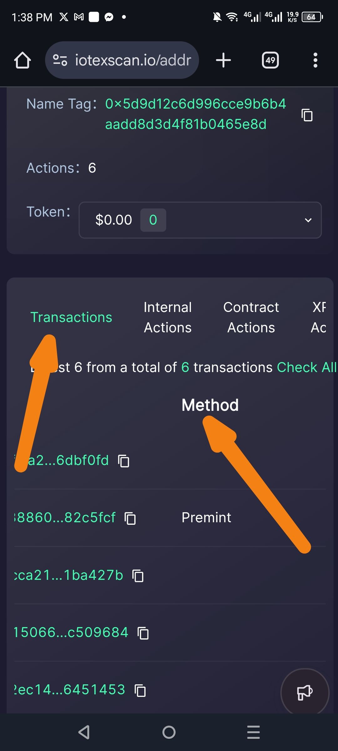
iotexscan.io/addr...Feature: Transaction History Table
Description: The current mobile interface for IoTeXScan lacks essential "Advanced Filter" capabilities (such as filtering by Method, Date Range, or Token Type) found in standard blockchain explorers. Additionally, the "Method" header and column are poorly aligned, creating a disjointed layout where headers don't clearly correspond to the data rows below.
Steps to Reproduce:
Open
iotexscan.ioon a mobile device.Navigate to any address with multiple transaction types (e.g., Mint, Transfer, Contract Call).
View the Transactions tab.
Attempt to find a filter icon or "Advanced" search toggle.
Observe the alignment of the "Method" label compared to the transaction list below.
Actual Result:
Missing Functionality: No options exist to filter transactions by "Method" (e.g., filtering only for 'Premint' or 'Transfer').
Design Inconsistency: The "Method" header is floating in the center-right of the screen with excessive local whitespace, making it look disconnected from the transaction entries.
Truncated Headers: Tab titles (Transactions, Internal Actions, etc.) are cramped and lack proper spacing for touch interaction.
Expected Result:
A filter icon or "Advanced Filter" button should be present to allow users to refine results.
The table headers (Method, TxID, Value) should be vertically and horizontally aligned with their respective data columns.
The UI should provide a "Method" dropdown to filter the list by specific interaction types.
Impact:
Efficiency Loss: Power users and developers cannot quickly isolate specific activities (like contract interactions) without scrolling through all logs.
Poor UX: Navigation is difficult on mobile due to the lack of clear tabular structure.
Data Readability: Misaligned headers mean users have to "guess" which column represents which data point when scanning quickly.
Suggested Fix:
Introduce Filter UI: Add a funnel icon or "Filter by Method" dropdown menu above the transaction list.
Structural Realignment: Adjust CSS Flexbox/Grid properties to ensure the "Method" header sits directly above the method labels (like 'Premint') in each row.
Sticky Headers: Implement sticky headers for the transaction list so users don't lose context while scrolling.
Responsive Spacing: Utilize a "Mobile Card" view for transactions where each transaction is a contained card, rather than a truncated table row, to better present the Method, To/From, and Value data.
Wallet Address: io1tkw393kejmxwnd454twc6020sxcyvh5dxqmren
Device & Environment:
-Operating system: Android 13
-Device model: Redmi Note 10 Pro
Please authenticate to join the conversation.
In Review
New Issue
5 months ago

cryptotestnet
Subscribe to post
Get notified by email when there are changes.
In Review
New Issue
5 months ago
cryptotestnet
Subscribe to post
Get notified by email when there are changes.