[ECO Bounty] ioTexScan Transaction "OUT" Label Design & Accessibility Issue
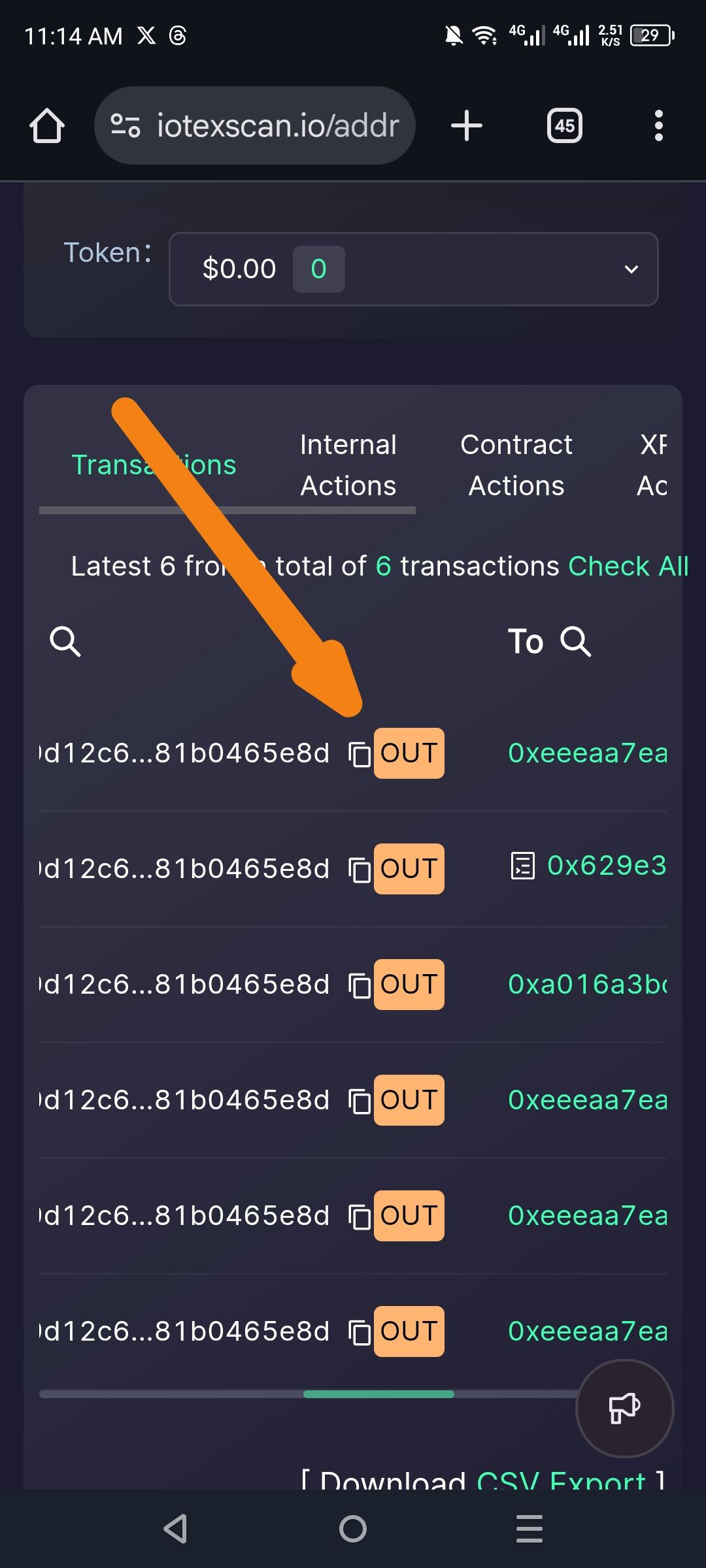
Severity: 🟡 Low to Medium (Accessibility & UX)
Environment:
Platform: Web (Mobile Browser)
URL:
iotexscan.io/addr...Device: Android (Chrome/WebKit-based browser)
View: Transaction History List
Description: On the IoTeXScan address details page, the transaction type labels (specifically "OUT") are styled with an orange/salmon background that resembles clickable buttons rather than status badges. This creates confusion about interactivity and may present color contrast issues for accessibility. The styling appears inconsistent with standard blockchain explorer UX patterns where transaction direction is typically indicated through subtle text colors or icons rather than solid button-like backgrounds.
Steps to Reproduce:
Open mobile browser and navigate to
iotexscan.io.Search for any wallet address with outgoing transactions.
Scroll to the transaction history list.
Observe the orange "OUT" label positioned between the TxID and recipient address.
Actual Result:
The "OUT" label uses a solid orange/peach background (
#FFA07Aor similar) with dark text.Visual styling mimics a clickable button or CTA (Call-to-Action), though it appears to be non-interactive status text.
High visual weight draws disproportionate attention compared to critical data (addresses, amounts).
If colorblind accessibility is considered, the orange may be difficult to distinguish from potential "IN" labels without additional visual indicators.
Expected Result:
"OUT" should use a subtle badge style (outline or light tint) rather than solid fill.
Should include an accompanying icon (arrow up/out) to indicate direction, aiding colorblind users.
Text should have WCAG AA compliant contrast ratio (minimum 4.5:1).
Visual hierarchy should prioritize transaction values and addresses over direction labels.
Impact:
Accessibility: Users with color vision deficiencies may struggle to distinguish "OUT" from "IN" if color is the sole differentiator.
UX Confusion: Button-like appearance suggests clickability; users may attempt to tap the label expecting a filter or action menu.
Visual Clutter: High-contrast orange tags create repetitive visual noise when scanning through multiple transactions.
Professional Perception: Design inconsistency with modern blockchain explorers (Etherscan, BscScan) may reduce perceived platform maturity.
Wallet Address: io1tkw393kejmxwnd454twc6020sxcyvh5dxqmren
Device & Environment:
-Operating system: Android 13
-Device model: Redmi Note 10 Pro
Log in to comment and vote
Comments1
cryptotestnet
Feb 26
Suggested Fix:
Badge Restyle: Convert from solid orange fill to:
Subtle orange outline (
border: 1px solid #FF6B35) with transparent/light background, ORLight orange tint (
background: rgba(255, 107, 53, 0.1)) with darker orange text.Add Iconography: Prefix with directional icon:
"OUT": Arrow up-right (↗️) or paper plane icon
"IN": Arrow down-left (↙️) or download icon
Typography: Use all-caps or small-caps with increased letter-spacing (
letter-spacing: 0.05em) and font-weight 500-600.Color Contrast: Ensure contrast ratio meets WCAG AA standards (minimum 4.5:1 for normal text).
Responsive Sizing: Reduce padding on mobile to prevent label from dominating the limited screen width.