[ECO Bounty] Lack of Modern Visual Effects & Interaction Feedback in ioPay UI
Description
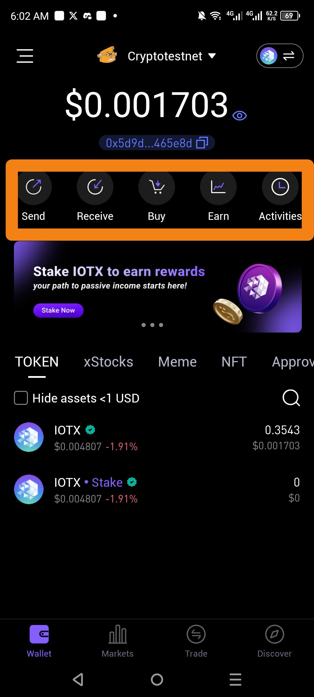
The primary action buttons (Send, Receive, Buy, Earn, Activities) on the ioPay main dashboard lack modern visual effects, such as depth, micro-animations, or dynamic interaction feedback. The current icon set and container design appear static and flat, failing to utilize modern UI trends like glassmorphism, haptic-linked animations, or gradient glows that are common in high-end Web3 wallets.
Severity
Low — This is a cosmetic and experiential issue that does not impact core wallet security or transaction capabilities.
Impact
User Engagement: The interface feels "static," which can lead to a less immersive experience for power users who expect a premium, high-tech feel from a blockchain wallet.
Perceived Innovation: In the competitive Web3 space, "flat" and non-reactive designs can make a platform appear less technologically advanced than competitors that use fluid motions and layered effects.
Brand Aesthetic: The mismatch between high-quality 3D assets (like the "Stake IOTX" coins) and the plain, flat action buttons creates a fragmented visual identity.
Reproduce
Open the ioPay application to the Wallet tab.
Locate the horizontal row of action buttons (Send, Receive, Buy, Earn, Activities).
Tap on an icon or hover (if applicable) and observe the lack of secondary visual transitions, shadow shifts, or glow effects.
Observe the pagination dots (three dots) below the banner, which remain simple and static.
Expectation
Micro-animations: Icons should have subtle movement (e.g., the "Send" arrow shifting slightly) when the dashboard loads or when touched.
Visual Depth: Buttons should utilize subtle gradients, outer glows, or "glass" backgrounds to stand out against the dark theme.
Active States: Tapping a button should provide a clear, modern visual pulse or a slight scale-down effect to acknowledge the user's intent.
Actual
The icons are standard flat glyphs inside simple dark circles with no active lighting effects, transitions, or modern depth styling.
Suggest Fix
Implement "Glow" States: Add a subtle brand-colored (purple/blue) outer glow to the active button or as a hover/tap effect to simulate "energy."
Layered Design: Use a semi-transparent "glassmorphism" background for the action row to create a sense of hierarchy and depth over the main wallpaper.
Animated Transitions: Integrate Lottie or Rive animations for the core icons to make the interface feel "alive" and responsive.
Haptic Integration: Pair subtle UI scale-down effects with haptic feedback to provide a tactile, modern "click" feel.
Wallet Address: io1tkw393kejmxwnd454twc6020sxcyvh5dxqmren
Device & Environment:
-Operating system: Android 13
-Device model: Redmi Note 10 Pro
Please authenticate to join the conversation.
In Review
New Issue
5 months ago

cryptotestnet
Subscribe to post
Get notified by email when there are changes.
In Review
New Issue
5 months ago
cryptotestnet
Subscribe to post
Get notified by email when there are changes.