[ECO Bounty] Mimo Exchange Connect Wallet Button UI/Layout Issue (Mobile)
Platform: Mobile Web (Android/Chrome)
Component: Wallet Connection UI
Severity: Low-Medium (UX/Visual)
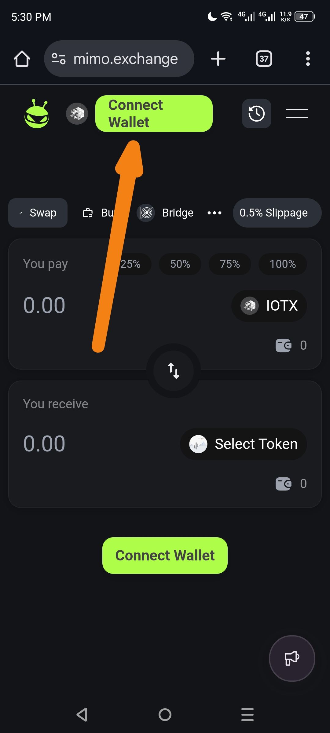
Description: The "Connect Wallet" button in the top navigation bar displays layout issues on mobile devices. The text appears to wrap awkwardly onto two lines ("Connect" / "Wallet"), making the button look broken or cramped. Additionally, there are two "Connect Wallet" buttons visible simultaneously (one in header, one in the main swap card), which may confuse users.
Steps to Reproduce:
Open mimo.exchange on a mobile browser (Android)
Ensure wallet is disconnected (incognito mode)
Observe the header navigation bar
Notice the lime green "Connect Wallet" button text wrapping
Scroll down to see the secondary "Connect Wallet" button in the swap interface
Expected Behavior:
Header button should display "Connect Wallet" on a single line, or use a wallet icon + "Connect" text to save space
Button should be properly sized to accommodate text without wrapping
Ideally, only one primary CTA should be visible to avoid confusion
Actual Behavior:
Header "Connect Wallet" button text wraps to two lines (see orange arrow in screenshot)
Button appears cramped/squished in the header area
Redundant "Connect Wallet" button appears both in header and main swap card
Suggested Fixes:
Adjust CSS/Button width to prevent text wrapping, or change text to "Connect" only with a wallet icon
Consider hiding the header wallet button when the main swap card button is visible, OR
Make the header button an icon-only button on mobile viewports (< 768px)
Wallet Address: io1tkw393kejmxwnd454twc6020sxcyvh5dxqmren
Device & Environment:
-Operating system: Android 13
-Device model: Redmi Note 10 Pro
Please authenticate to join the conversation.
In Review
New Issue
5 months ago

cryptotestnet
Subscribe to post
Get notified by email when there are changes.
In Review
New Issue
5 months ago
cryptotestnet
Subscribe to post
Get notified by email when there are changes.