[ECO Bounty] mimo Exchange UI Misalignment and Non-Functional Tooltip on RPC Help Icon
Description
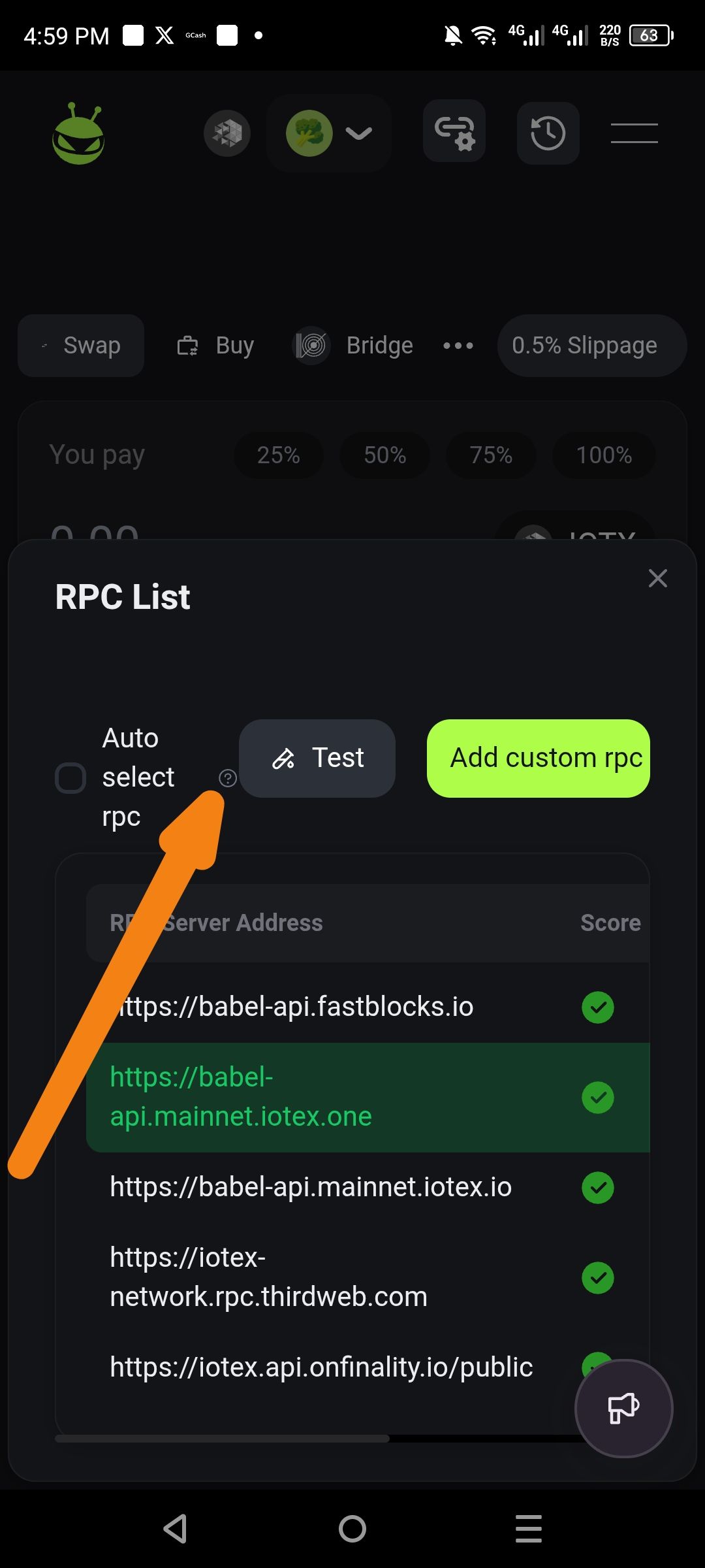
In the RPC List modal, the help information icon (?) is improperly positioned, appearing partially behind or overlapping the "Auto select rpc" label. Additionally, tapping or clicking this icon fails to trigger a tooltip, pop-over, or any descriptive prompt message explaining the feature.
Severity
Low – This is a cosmetic and minor functional issue that does not prevent the user from completing transactions, but it degrades the professional quality of the UI.
Impact
User Confusion: Users are unable to learn how the "Auto select rpc" feature works because the help prompt is unresponsive.
Visual Polish: The overlapping text and icon create a cluttered and unpolished look for the interface.
Reproduce
Open the Mimo exchange interface.
Navigate to the RPC settings/list modal (accessible via the connection/settings icon in the header).
Observe the placement of the (?) icon next to the "Auto select rpc" text.
Click or tap on the (?) icon.
Expectation
UI: The help icon should be clearly spaced to the right of the text label without overlapping.
Functionality: Clicking the icon should display a prompt or tooltip explaining that "Auto select rpc" automatically chooses the fastest available server.
Actual
UI: The icon is positioned too close to the text, causing visual overlap.
Functionality: No prompt, message, or action occurs when the icon is clicked.
Suggest Fix
CSS Adjustment: Apply a
margin-leftorpaddingto the help icon element to ensure it sits clearly to the right of the "Auto select rpc" string.Trigger Event: Bind a click/hover event to the icon to launch a standard UI tooltip or modal prompt containing the explanatory text.
Wallet Address: io1tkw393kejmxwnd454twc6020sxcyvh5dxqmren
Device & Environment:
-Operating system: Android 13
-Device model: Redmi Note 10 Pro
Please authenticate to join the conversation.
In Review
New Issue
5 months ago

cryptotestnet
Subscribe to post
Get notified by email when there are changes.
In Review
New Issue
5 months ago
cryptotestnet
Subscribe to post
Get notified by email when there are changes.