[Eco Bounty] mimo exchange UI Overlap and Typo in Swap Modal
1. UI Element Overlap (Primary Issue)
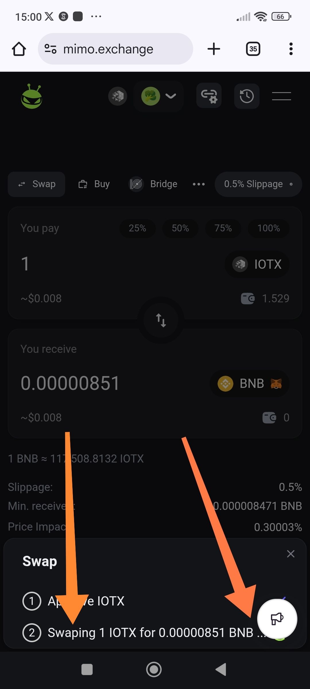
Description: The feedback/announcement megaphone button (bottom right) overlaps the "Swap" transaction modal.
Actual Result: The megaphone icon sits directly on top of the transaction status text, obstructing the view of the swap progress.
Expected Result: The modal should have a higher z-index or the megaphone icon should be hidden/repositioned when a transaction modal is active to prevent visual clutter.
Severity: Low (UX/UI Polish)
2. Spelling Error in Transaction Text
Description: In the second step of the Swap modal, there is a typo in the word "Swapping."
Actual Text: "Swaping 1 IOTX for..."
Expected Text: "Swapping 1 IOTX for..."
Severity: Low (Cosmetic)
Steps to Reproduce:
Navigate to mimo.exchange on a mobile browser.
Connect a wallet and select IOTX to BNB (or any pair).
Enter an amount and click Swap.
Observe the "Swap" progress modal that appears at the bottom of the screen.
Note: The orange arrow in the attached screenshot specifically highlights the megaphone icon obstructing the transaction details.
Would you like me to help you find their official support email or Telegram/Discord handle so you can send this over to them?
Wallet Address: io1tkw393kejmxwnd454twc6020sxcyvh5dxqmren
Device & Environment:
-Operating system: Windows 11 Pro
-Device model: A520MHP
Please authenticate to join the conversation.
In Progress
New Issue
6 months ago

cryptotestnet
Subscribe to post
Get notified by email when there are changes.
In Progress
New Issue
6 months ago
cryptotestnet
Subscribe to post
Get notified by email when there are changes.